
AI Wallpaper Generator: 4K Desktop and Phone Wallpapers
How to use an AI wallpaper generator for 4K desktop and phone backgrounds: device sizes from Apple's spec pages, safe zones, prompts, free credits, recuts.
 Maya Chen 10 min read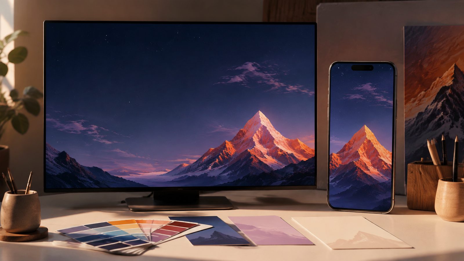
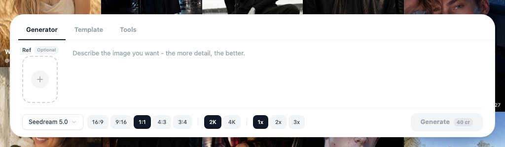
An AI wallpaper generator gives you a background built for one screen: the right pixel size, the subject placed where icons and the clock will not cover it, and a file you own. In LazyKiwi that means a text prompt in Seedream 5.0 or Nano Banana, both of which render up to 4K, then a recut with the image extender for the second device. On September 6, 2026 a 2K Seedream 5.0 image showed 40 credits on the Generate button, which is exactly the monthly free allowance. Below: what these tools make, the exact sizes for current iPhones and Macs from Apple's spec pages, prompts that hold up at 4K, and the mistakes that make a wallpaper unusable.
What can an AI wallpaper generator make?
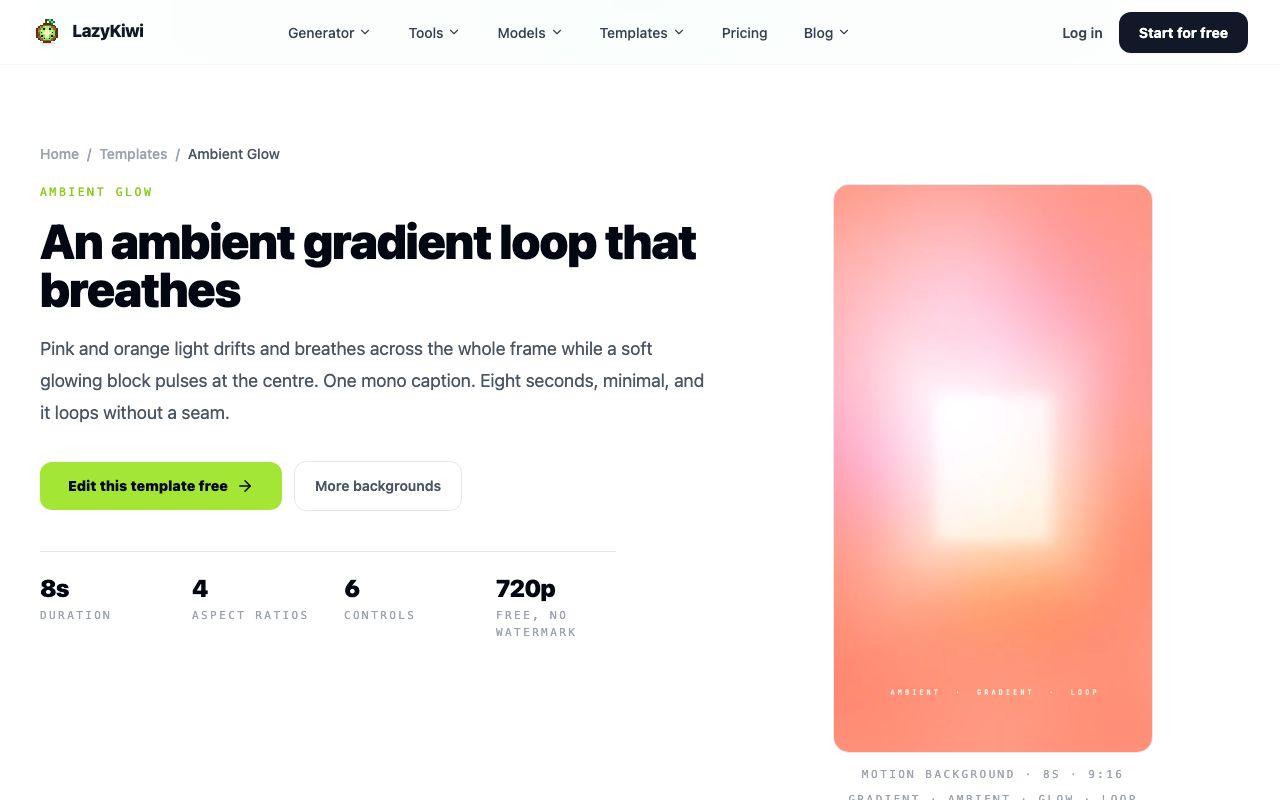
Three kinds of file. A static image in any ratio, which is what most people want and what this guide covers. A short looping video for phones and desktops that support live backgrounds; LazyKiwi's ambient gradient template renders an 8-second seamless loop at 720p, free and without a watermark, and the iridescent 3D loop background does the same with a metallic surface. And a matched set, where one scene is generated once and recut for a monitor, a laptop and a phone so the desk looks coordinated.
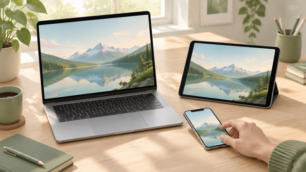
Style is open: photographic scenery, flat minimal shapes, painted fantasy, abstract gradients. Resolution is the practical limit. Both LazyKiwi image models list output up to 4K on their pages, and Seedream 5.0 starts at 2K in the workbench, so you are never upscaling a small file to fake sharpness.
Who owns an AI wallpaper you generate?
For your own screen it does not matter. If you plan to sell or share the file, note that the U.S. Copyright Office's report on copyright and artificial intelligence takes the position that material generated entirely by a machine, without meaningful human authorship, is not protected, per the U.S. Copyright Office (2026). A wallpaper you composed, edited and recut has a stronger claim than a raw render.
How to make an AI wallpaper step by step
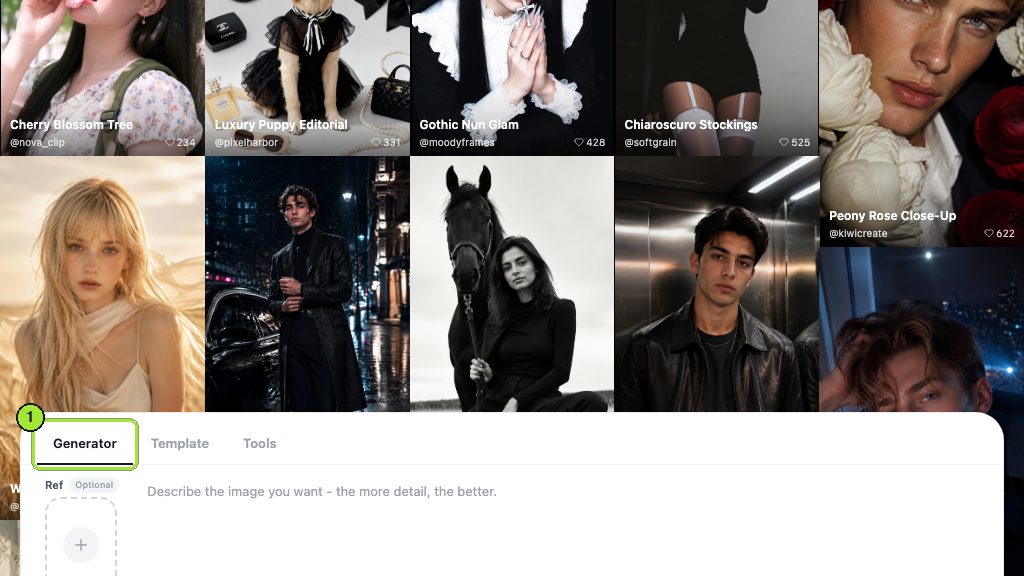
The sequence below is what I use in the AI image generator; it puts the device decision first because every later choice depends on it.
- 1
Pick the device and its ratio
Phone: 9:16. Laptop or monitor: 16:9. Ultrawide: 21:9, which Nano Banana lists among its ten-plus ratios. Decide before you write a word of prompt.
- 2
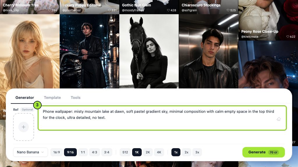
Write a composition-first prompt
Name the subject, then where it sits: 'subject in the lower right third, empty sky across the top half'. Add the palette and lighting, then the exclusions: 'no text, no watermark, no people'.
- 3
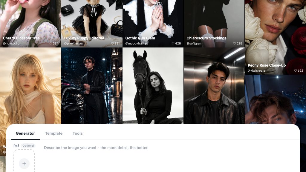
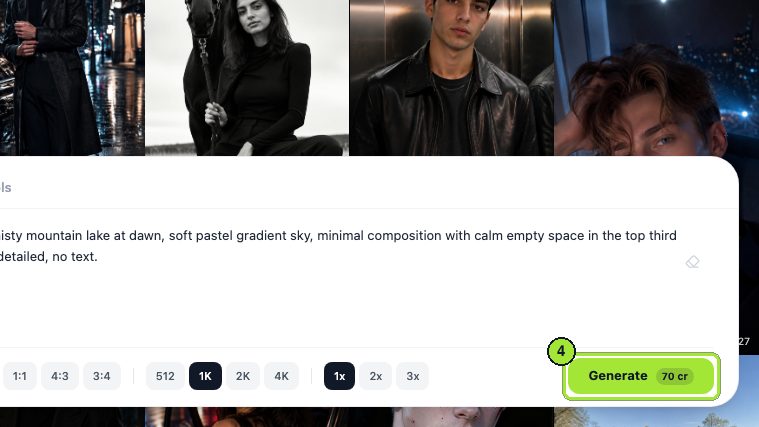
Generate at 2K or 4K
In Seedream 5.0 the size picker starts at 2K. In Nano Banana choose 4K for a monitor. The credit figure on the button updates when you change size; check it before you click.
- 4
Check the safe zones
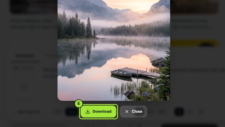
Open the result full size and imagine the clock band at the top of a phone or the dock and desktop icons on a computer. If the focal point sits under either, regenerate with a stronger placement cue.
- 5
Recut for the second device
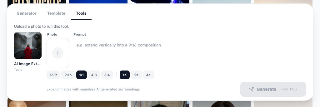
Send the file to the AI image extender and ask for the other ratio; the tool paints new background past the edges rather than stretching.
- 6
Set it and look again
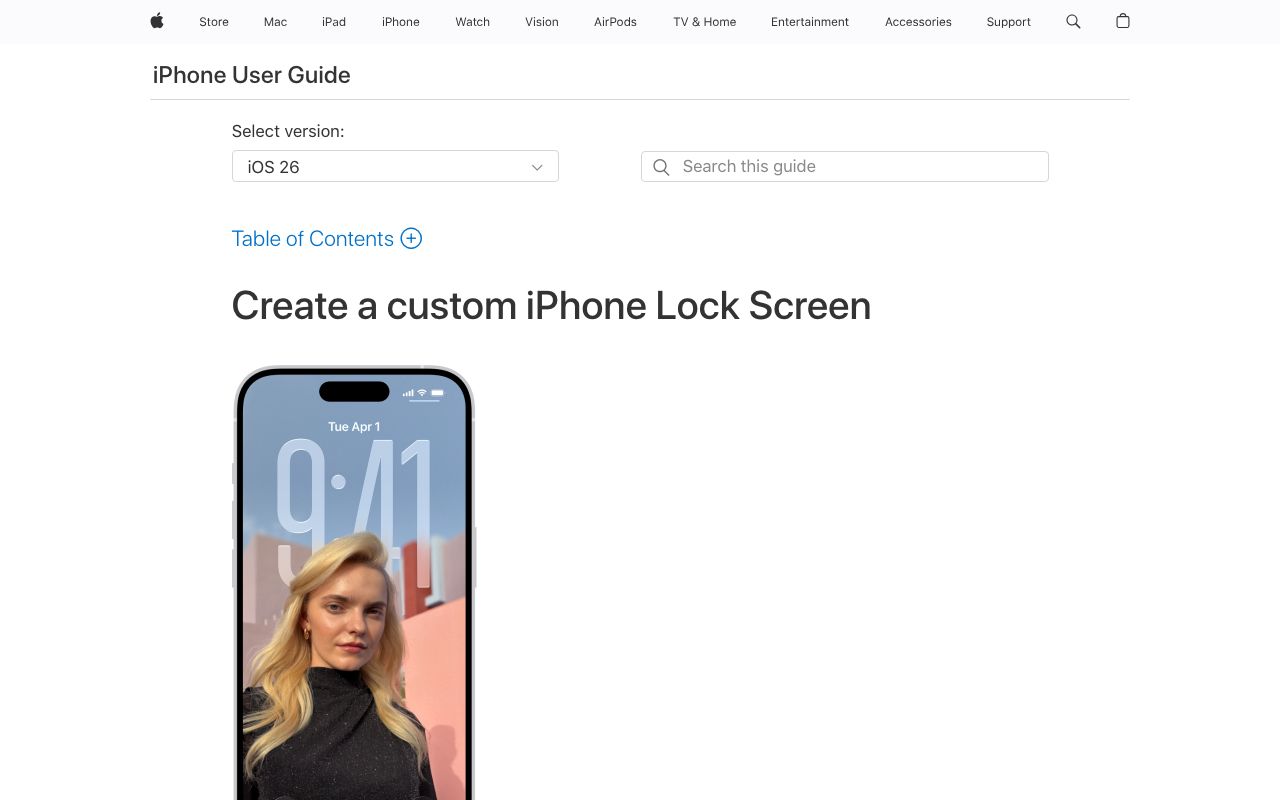
Apply the wallpaper on the real device. Apple documents both the iPhone Lock Screen flow and the Mac wallpaper settings in its user guides.
Which sizes do you need for iPhone, Android, Mac and Windows?
Use the native pixel count of the screen, not a guess. Apple publishes each display's resolution on its spec pages: the iPhone 16 is 2556 by 1179 pixels and the iPhone 16 Plus is 2796 by 1290, per Apple (2026), and the 13.6-inch MacBook Air is 2560 by 1664, per Apple (2026). For monitors, YouTube's encoding table is a handy reference for the standard 16:9 sizes: 1080p is 1920 by 1080, 1440p is 2560 by 1440 and 4K is 3840 by 2160, per YouTube Help (2026).
| Screen | Native pixels (source above) | Generate at | Keep clear |
|---|---|---|---|
| iPhone 16 | 2556 x 1179 | 9:16 at 4K, or 2K then upscale | Top fifth for the clock; bottom strip for the dock |
| iPhone 16 Plus | 2796 x 1290 | 9:16 at 4K | Same as above |
| Android phone | Varies by model; check the maker's spec sheet | 9:16 at 4K | Top band for the clock; center for widgets |
| MacBook Air 13.6-inch | 2560 x 1664 | 16:9 at 4K, then extend to 16:10 | Right edge for desktop icons; bottom for the Dock |
| 1080p monitor | 1920 x 1080 | 16:9 at 2K | Left edge and taskbar strip |
| 4K monitor | 3840 x 2160 | 16:9 at 4K | Left edge and taskbar strip |
Android sizes are not in one place because every maker publishes its own. Google's Android Help covers how to set a wallpaper, per Android Help (2026), but for pixel dimensions open your phone's spec sheet. Generating at 4K in 9:16 covers every current phone with room to crop.
Where should the subject sit?
On a phone, the clock and date take the top fifth and widgets sit below them, so put the focal point in the lower half and keep the top quiet. On a Mac or Windows desktop, icons stack from one edge and a dock or taskbar runs along the bottom, so an off-center subject with an empty side survives daily use. A centered hero looks good in the preview and disappears behind windows.
What prompts produce good 4K AI wallpapers?
At 4K the model has room for detail, which is also room for artifacts. Prompts that work name a simple structure and let the resolution carry texture. Four I reuse, including the AI dragon wallpaper 4K request that people search for most:
Layered desert mesas at dawn, flat vector illustration, five tones of dusty orange and blue, subject in the lower right third, empty gradient sky across the top and left, no text, no watermark, 16:9.
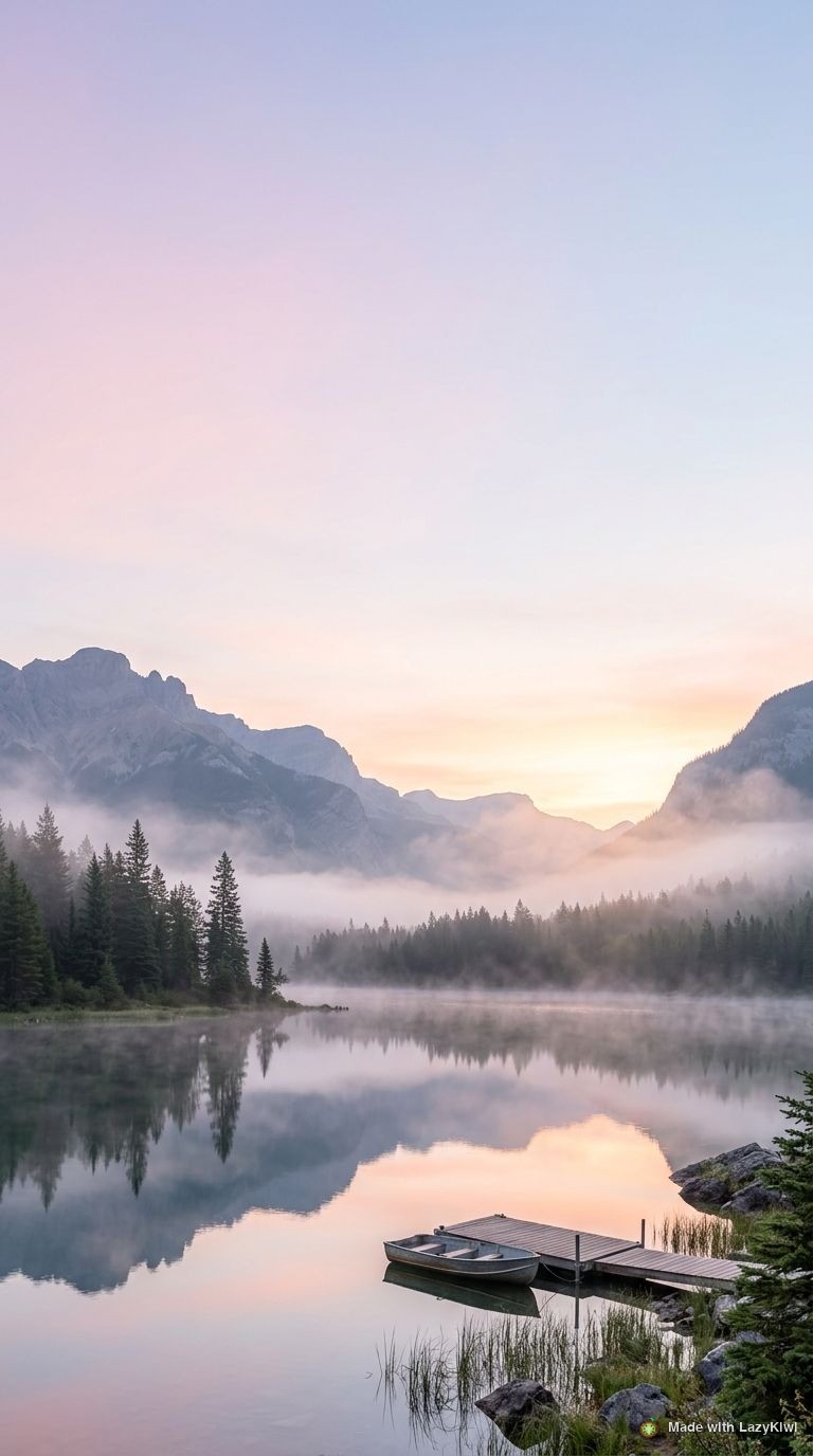
A single pine on a ridge above a sea of fog, soft morning light, muted greens and grays, tree in the lower third, calm empty sky filling the top half, no text, no people, 9:16.
A jade dragon coiled around a mountain peak at night, painted fantasy style, cool teal and gold palette, dragon in the lower half, stars and thin cloud across the top, no text, no watermark, 9:16.
Slow folded ribbons of frosted glass, dark charcoal background, one soft amber light from the upper left, shapes concentrated on the right side, left third nearly empty, no text, 16:9.
Which words to leave out?
'Highly detailed', 'epic' and '8K' add noise, not resolution. The size picker sets the pixels; the prompt should set the composition. Also drop competing style labels: 'cinematic, anime, oil painting, photoreal' in one line produces a muddle at any size. One style, one subject, one placement cue.
Is there a free AI wallpaper generator?
Yes, for a small number of images. New LazyKiwi accounts receive 40 credits a month with no card, per the pricing page. On September 6, 2026 that covered exactly one Seedream 5.0 image at 2K, which showed 40 credits, or three image extender runs at 13 credits each. Nano Banana showed 70 credits at 1K, so it is not the free-tier choice. An AI wallpaper generator free of charge is therefore one good 2K image a month on the free plan, plus the free motion templates. In LazyKiwi's workbench data (August 2026), the median time from signup to a first generation was about 1.5 minutes and 103 of 108 first generations happened within 10 minutes, so the free credit tends to be spent in the first session; decide the device and ratio before you sign up.
| Option | What is free (checked 2026-09-06) | Notes |
|---|---|---|
| LazyKiwi Seedream 5.0 | 40 monthly credits; 40 credits per 2K image | One 2K wallpaper a month free; 4K costs more |
| LazyKiwi motion templates | Ambient gradient and iridescent loops at 720p, no watermark | Live wallpaper loops |
| Wallhaven | Community wallpaper library | Not AI; browse by tag and resolution |
| Wallpaper Engine | One-time purchase on Steam; Workshop wallpapers free | Windows live wallpapers, not a generator |
| Pixlr, Fotor, Krea | Free tiers with their own limits | Wallpaper maker style editors; check each pricing page |
Wallhaven is a large tagged library of user-uploaded wallpapers, per Wallhaven (2026), and Wallpaper Engine is a one-time purchase that runs animated backgrounds on Windows with free community wallpapers from the Steam Workshop, per Wallpaper Engine (2026). Neither generates images. Among wallpaper maker style editors, Pixlr (2026) and Fotor (2026) bundle an image generator into a photo editor, and Krea (2026) is a generation workspace; all three publish their own free limits, which change often enough that I am not quoting them.
How to turn one wallpaper into desktop and phone versions
Do not generate the phone version from scratch; you will get a different scene. Recut the one you already like. The AI image extender reads the lighting, grain and perspective at the border and paints new background outward, leaving the original pixels untouched, so a 16:9 desktop scene becomes a 9:16 phone scene with the same subject.
- Start from the desktop version, which has the most scene to work with.
- Ask for the frame, not the content: 'extend vertically into 9:16, keep the horizon level'.
- Check the new top half is calm; it will sit under the clock.
- For a 16:10 MacBook screen, extend the 16:9 file a little at the top and bottom rather than cropping the sides.
- Upscale last, once, with the AI photo upscaler if the recut came out at 2K and the screen is 4K.
Name the files by screen
Save as scene-2560x1664.png and scene-2556x1179.png. In a month you will not remember which recut fits which device.
What mistakes make AI wallpapers hard to use?
Most failures are not rendering errors; they are layout errors that only show up on the device.
- A busy center. Detail under the clock or behind open windows reads as clutter. Keep contrast at the edges and calm in the middle.
- Generating small and stretching. A 1K file on a 4K monitor is soft; render at 2K or 4K or upscale before use.
- Text artifacts. Models add pseudo-lettering to signs and posters; write 'no text, no watermark' in every wallpaper prompt.
- The wrong ratio. A 16:9 scene cropped to 9:16 loses the subject; recut with the extender instead.
- Faces on a work machine. A portrait wallpaper is distracting in screen shares; keep people out of desktop versions.
- Ignoring dark mode. Phones dim the wallpaper behind widgets; test the lock screen at night before you commit.
Custom wallpaper work is mostly about restraint. The generator can produce anything; the screen can only show what survives icons, a clock and a taskbar. Design for the second, and the AI wallpapers you keep will be the quiet ones.
Key takeaways
- Generate at the screen's native size: iPhone 16 is 2556 x 1179, the 13.6-inch MacBook Air is 2560 x 1664 and a 4K monitor is 3840 x 2160, all from Apple's spec pages and YouTube's resolution table.
- Seedream 5.0 showed 40 credits for a 2K image on September 6, 2026, which is exactly the monthly free allowance; Nano Banana showed 70 credits at 1K.
- Write placement into the prompt: subject in the lower or side third, an empty band where the clock, dock or icons will sit, and 'no text, no watermark' every time.
- Recut one scene for other devices with the AI image extender at 13 credits a run instead of generating a second, different image.
- For live backgrounds, the ambient gradient and iridescent loop templates render 8-second seamless loops at 720p free of charge.
Image & Design Editor
Maya Chen
I spend my days inside image tools, testing prompts and settings on real photos so the steps here match what you actually see on screen.
FAQ
Common questions
How do I generate custom AI wallpapers for Android?
Open the LazyKiwi image generator, choose Seedream 5.0 or Nano Banana, set 9:16 and 4K, and write a prompt that places the subject in the lower half with a calm band across the top for the clock. Download the PNG, move it to the phone and set it through the wallpaper settings that Google's Android Help describes. Android screen sizes vary by maker, so 4K in 9:16 leaves room to crop on any model.
What resolution is a 4K wallpaper?
For a standard 16:9 monitor, 4K means 3840 by 2160 pixels, the same figure YouTube lists for 2160p in its encoding table. Phones do not use that size: the iPhone 16 display is 2556 by 1179 pixels according to Apple's spec page, and Android models differ. Generate at the 4K size in LazyKiwi and let the device scale down rather than upscaling a smaller file.
Can I use AI wallpapers commercially?
Check two things. LazyKiwi's terms cover what you may do with generations on your plan, and the U.S. Copyright Office's AI report takes the position that purely machine-generated images without meaningful human authorship are not protected by copyright, so a raw render is hard to defend if copied. A composed, edited and recut set with your own work in it is the safer product.
How do I make a live wallpaper with AI?
Use a motion template rather than an image model. LazyKiwi's ambient gradient template renders an 8-second seamless loop at 720p in four aspect ratios, free and without a watermark, and the iridescent 3D loop background does the same with a metallic surface. Render at 9:16, download the MP4 and set it as a live wallpaper on a phone that supports it; on Windows, Wallpaper Engine plays video loops.
Which AI is best for wallpapers?
In LazyKiwi, Seedream 5.0 is the default: it starts at 2K, goes to 4K, accepts an optional reference image and showed 40 credits per 2K image on September 6, 2026. Nano Banana is the choice for unusual ratios such as 21:9 ultrawide, with ten or more aspect ratios and 4K output, at 70 credits for a 1K image. For phone recuts of either, the AI image extender at 13 credits beats regenerating.
Generate a wallpaper for your screen
Open the LazyKiwi image generator with Nano Banana preselected, pick the ratio for your device, paste one of the prompts above and render at 4K.
Keep reading
9 Canva Alternatives for 2026: Free and Paid Tools Compared
Nine Canva alternatives compared on pricing checked today, free tiers and AI features, plus a one-brief test you can repeat in Figma, Express and LazyKiwi.
10 min read
AI Coloring Page Generator: Printable Pages for Kids
Use an AI coloring page generator to make printable line art: prompts by age, photo-to-page conversion, 300 DPI export, free credits and Etsy or TPT rules.
9 min read
AI Sticker Generator: WhatsApp, Telegram and iMessage Packs
Build a matching sticker pack with an AI sticker generator, then hit the real WhatsApp, Telegram and iMessage specs: 512 px, WebP or PNG, tight file limits.
10 min read
AI Thumbnail Maker Guide for Better YouTube Thumbnails
Learn how to choose an AI thumbnail maker, write composition-aware prompts, generate useful variants, add readable text, and test YouTube thumbnails at feed size.
8 min read