
Workout Summary Card
A number counter animation for a session recap
A darkened photo, a hand-drawn route line, and 684 rolling up from zero in 260px type. Three stats rise in underneath, then a goal bar draws itself across to a star. Kiwi green on near-black, six seconds.
- 6s
- duration
- 4
- aspect ratios
- 7
- controls
- 720p
- free, unlimited exports
Social Hooks · 6s · 9:16
Stats · Counter · Recap · Fitness
The recap card, where the number is the input
Every fitness app ships one of these, and every one of them is generated from data. This template works the same way: the headline figure is a range control, and the count-up is computed from it — set it to 1,240 and the roll runs to 1,240, with the goal percentage underneath recalculating against the target. You are not keyframing digits, you are typing a number.
Around it sits the rest of the recap: a SESSION COMPLETE badge, a date line, a looping route drawn as a path over the photo, three labelled stats separated by dividers, and a progress bar that draws to a star at the end. The background photo is a named slot with a scrim already applied, so any image you drop in keeps the type readable.
6 seconds, three beats
What is on screen, and when. Every element named here is a layer in the document — you can click any of them on the canvas and change it.
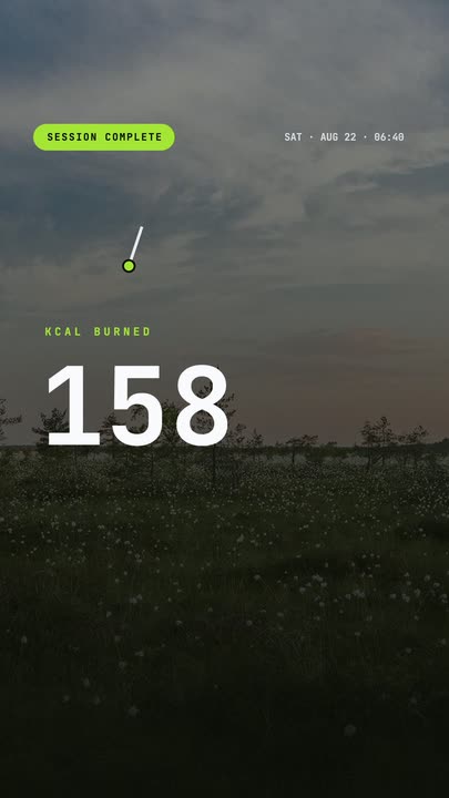
Beat 1 · 1.1s
Badge and date
The photo is already scrimmed, the SESSION COMPLETE badge slides in with the date line, and the route path begins drawing itself over the top.
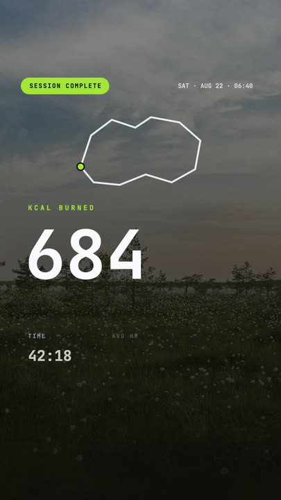
Beat 2 · 2.4s
The number rolls
The headline figure counts up in the middle of the frame with its KCAL BURNED label above it, while the route finishes its loop.
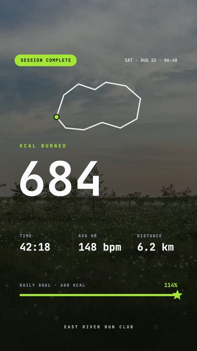
Beat 3 · 4.3s
Stats and goal bar
The three stats rise into place between their dividers, the goal bar draws across to the star, and the percentage lands on its final value.
Three steps to a recap card
- 01
Set the headline number
Drag the calories control anywhere from 100 to 2,000. The count-up animation and the goal percentage both derive from it, so the whole card stays internally consistent.
- 02
Fill in the stats and photo
Type the time, and edit the two other stat pairs on the canvas. Upload your own background photo — the scrim over it is part of the template, so contrast holds.
- 03
Recolour and export
The accent runs the badge, the route, the bar fill and the star. Set it to your app's colour and export vertical for a share sheet or 1:1 for a feed post.
Counted, not typed
The number rolls up from zero
The headline figure animates from 0 to your value across the middle of the clip, and the goal percentage below it counts in step. Because both are generated from one control, they can never disagree with each other the way two hand-keyed text layers eventually do.
A bar that draws
Progress you can see arrive
The goal bar draws left to right rather than fading in at full width, and finishes on a star that pops at the end. It is the single clearest way to show that something was completed, and it costs you nothing to set up.
Readable over anything
The scrim is part of the template
Your background photo sits under an authored darkening layer and a vignette, so a bright outdoor shot and a dim indoor one both leave the numbers legible. You do not have to colour-grade the photo to make the card work.
What you can change
Seven controls, with the stat labels, the date line and the goal target editable directly on the canvas.
- Click any element on the canvas to edit it directly
- Or describe the change in a sentence and let the assistant make it
- Export 9:16, 16:9, 1:1, 4:5 from the same document
Studio controls
7 named
- Badge textTextSESSION COMPLETE
- CaloriesSlider 100–2000684
- TimeText42:18
- AccentColour#A3E635
- Number sizeSlider 200–300260
- Background photoPhoto
- SpeedSlider 0.5–21
Why a template and not a screenshot
Screenshotting the app you used gets you that app's branding, its notification bar and a crop that never fits the frame. Rebuilding the same recap here takes about the same time as cropping the screenshot, and the result is yours: your colour, your photo, your typography, and a count-up that actually moves. It is also reusable — next session is one number away.
Workout Summary Card: questions, answered
Is the counter animation template free?+
Yes to open and edit. Free accounts get unlimited free 720p exports with a small LazyKiwi mark; clean 1080p is included with any paid plan.
What aspect ratios can I export?+
9:16, 16:9, 1:1 and 4:5 from the same document. Authored vertical at 1080×1920, retargeted rather than cropped.
Can I change the numbers and the colours?+
The headline figure is a slider from 100 to 2,000, the time is a text control, and the accent colour drives the badge, route, bar and star. The remaining stat labels and values are canvas-editable text.
Do I need After Effects?+
No — and this is the template where that matters most. A count-up in a desktop editor usually means an expression or a plugin. Here it is a number field.
How long is the clip?+
Six seconds. The count-up runs through the middle of it and everything is landed by 4.3s, leaving a hold at the end that reads as a still.
More charts & data
All data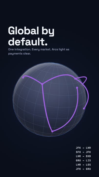 Globe ArcsA wireframe globe turns slowly on a midnight stage while six city-to-city arcs light up in sequence, with a route table ticking along beside it.
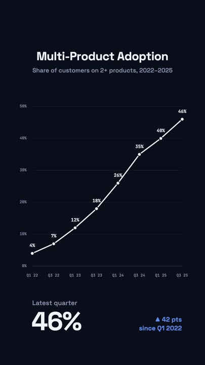 Stats Line ChartA white adoption line draws itself left to right over a dark grid; each node lights up with its percentage and a big KPI counts up below.
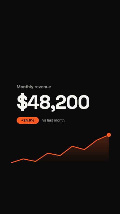 Financial FigureA dollar figure rolls up flush-left while a revenue curve draws underneath it and a soft area fades in below the line; a growth pill and comparison line drop in once the number lands
Make the number move.
Set the figure, drop your photo in and export a recap card where the count-up is generated, not keyframed.