
Stats Line Chart
Animated line chart template with a counting KPI
A white adoption line draws itself left to right over a dark grid. Eight nodes light up with their percentages as it passes, and a large KPI counts up to the final figure underneath.
- 6s
- duration
- 4
- aspect ratios
- 7
- controls
- 720p
- free, unlimited exports
Data & Charts · 6s · 9:16
Line chart · KPI counter · Infographic
A chart where the numbers are inputs
Search for an animated chart and you mostly find spreadsheet add-ons and desktop project files where every value is a keyframe someone typed. This is the version where the data drives the drawing: the seven segments of the line are drawn in sequence with a progress animation, the eight nodes and their percentage labels sit on the points, and the KPI at the bottom counts up to the last value. Change a figure and the geometry follows it.
The frame is deliberately spare — a title, a subtitle with the range and the metric, six horizontal grid lines with y-axis labels from 0% to 50%, and eight quarter labels along the bottom. The accent colour drives one thing only — the delta note beside the KPI. Everything else is white on near-black, which is what keeps the chart readable at thumbnail size.
6 seconds, three beats
What is on screen, and when. Every element named here is a layer in the document — you can click any of them on the canvas and change it.

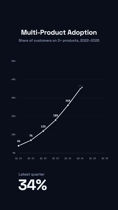
Beat 1 · 1.1s
Grid and title
The title and subtitle are set, the six grid lines and both axis label sets have faded in, and the first segment of the line is drawing from the left.
Beat 2 · 2.4s
The line climbs
Roughly half the segments are drawn, with each node lit and labelled as the line passes it, and the KPI beginning to count.
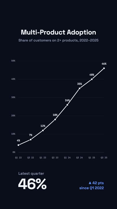
Beat 3 · 3.6s
The line completes
The line has reached the last node at 46%, and the KPI has landed on its final figure with the delta note beside it in the accent colour.
Three steps to an animated chart
- 01
Write the title and subtitle
The subtitle is where the range and the metric definition go — the line that stops a chart being ambiguous. Both are text controls.
- 02
Set the values
The node labels and the axis labels are canvas-editable text, and the KPI label is a control. Adjust the values and the drawn line, the node positions and the counter all follow.
- 03
Colour it and export
The line colour and the accent colour are separate controls, and line thickness runs 2–10px. Export 16:9 for a deck or 9:16 for a feed post.
It draws
The line is animated segment by segment
Each of the seven segments has its own draw progress, so the line grows left to right at a readable pace rather than appearing whole. That is the part that makes a viewer follow the trend instead of just registering a shape.
Nodes that arrive
Eight points, each labelled as the line reaches it
Every node pops and its percentage label fades up as the line passes through it, and the line finishes on the last point and holds. The chart tells its story in order instead of dumping it all in frame one.
A KPI that counts
The headline figure rolls to the final value
Under the chart, the last value counts up in large type with a delta note beside it. It is generated from the same data as the line, so the number and the shape can never disagree.
What you can change
Seven controls, with every axis label, node percentage and the delta note editable directly on the canvas.
- Click any element on the canvas to edit it directly
- Or describe the change in a sentence and let the assistant make it
- Export 9:16, 16:9, 1:1, 4:5 from the same document
Studio controls
7 named
- TitleTextMulti-Product Adoption
- SubtitleTextShare of customers on 2+ products, 2022–2025
- KPI labelTextLatest quarter
- LineColour#F1F5F9
- AccentColour#5B8DEF
- Line thicknessSlider 2–106
- SpeedSlider 0.5–21
Why not screenshot the dashboard
Dashboard screenshots carry the tool's chrome, the wrong aspect ratio and a colour palette you did not choose, and they are static in a feed that rewards motion. Rebuilding the same series here takes a few minutes, and next quarter it takes one: you change eight numbers and export again. That is the actual argument for a chart template — data animations are the ones you remake most often.
Stats Line Chart: questions, answered
Is the animated line chart free?+
Free to open and edit, with unlimited free 720p exports with a small LazyKiwi mark on the free tier. Clean 1080p is included with any paid plan.
What aspect ratios can I export?+
9:16, 16:9, 1:1 and 4:5. 16:9 is the right pick for a deck or a YouTube cut; the layout retargets for vertical rather than cropping the axis labels off.
Can I put my own numbers in?+
Yes. The values, axis labels, title, subtitle and KPI label are all editable, and the drawn line, the node positions and the counter are generated from them rather than drawn on top of them.
Do I need After Effects?+
No. Chart animations in a desktop editor usually mean a plugin or a stack of trim-path keyframes; here the draw is a property of the document.
How long is the clip?+
Six seconds, with the line completing at 3.6s and a hold after it. Slow it with the speed control if there is a lot of data to read.
More charts & data
All data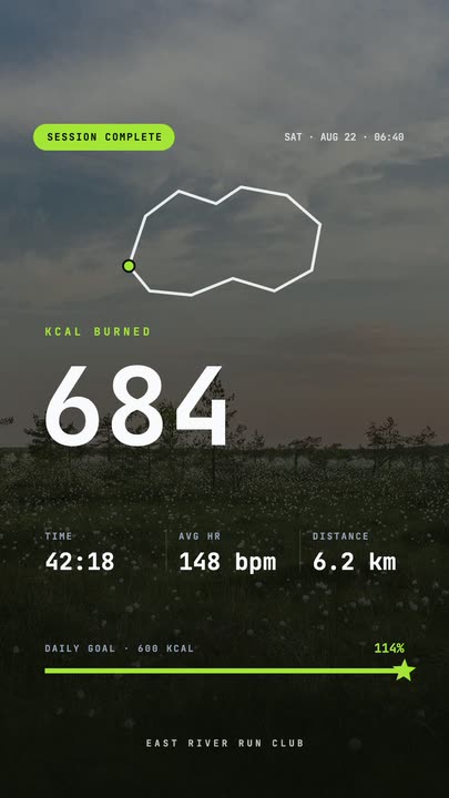 Workout Summary CardA fitness-app session recap over a darkened photo: the calorie count rolls up, three stats rise in and the goal bar draws itself to a star.
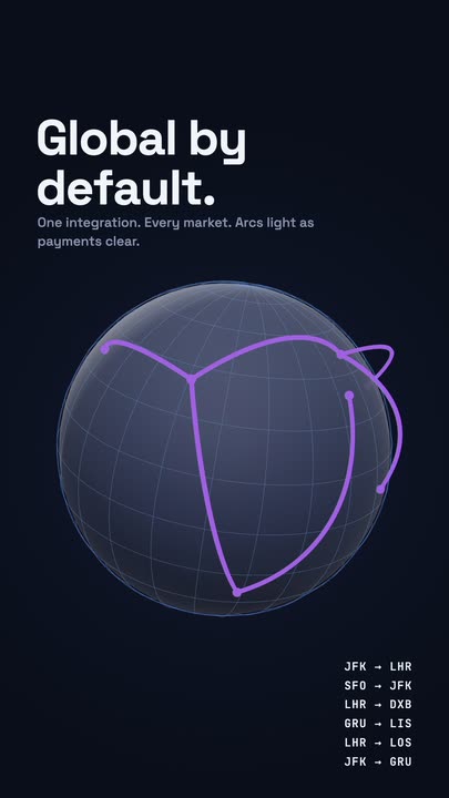 Globe ArcsA wireframe globe turns slowly on a midnight stage while six city-to-city arcs light up in sequence, with a route table ticking along beside it.
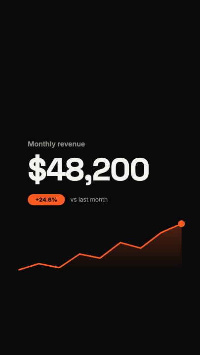 Financial FigureA dollar figure rolls up flush-left while a revenue curve draws underneath it and a soft area fades in below the line; a growth pill and comparison line drop in once the number lands
Your numbers, drawing themselves.
Type this quarter's figures in and export a chart animation in the aspect your deck or feed needs.